Website Speed Optimization: Tips for Front-End Developers
Table of Contents
Fast websites keep users happy. If a site loads quickly, users are more likely to stay longer and return. Slow sites can frustrate users, leading them to leave and not come back.
Google and other search engines favor fast-loading websites. Sites that load quickly often rank higher in search results. This means more visibility and more visitors from search engines.
A faster website can lead to higher conversion rates. When users have a smooth experience, they are more likely to make a purchase, sign up, or complete other desired actions. This directly impacts a business’s revenue and growth.
Skilled front-end developers know how to optimize websites for speed. They use techniques like minifying code, optimizing images, and implementing caching to make sites load faster.
In this blog, we share top tips for optimizing website speed. Businesses experiencing website load speed issues and planning to hire expert frontend developers will gain valuable insights and set realistic expectations. Additionally, this blog will benefit frontend developers seeking advanced tips on website speed optimization.
What Are the Most Important Website Performance Metrics?
The most important website performance metrics are page load time, time to first byte (TTFB), first contentful paint (FCP), and largest contentful paint (LCP). Now, let’s explore each of these metrics in detail to understand their significance and impact on website performance.
- Load Time: This is the total time it takes for a web page to fully load and be ready for user interaction. It includes loading all resources like images, scripts, and styles.
- Time to First Byte (TTFB): This measures the time from when a user requests a web page to when the first byte of data is received from the server. A shorter TTFB means the server is responding quickly.
- First Contentful Paint (FCP): This metric measures the time from when the page starts loading to when any part of the content is rendered on the screen. It indicates how quickly users see something on the page.
- Largest Contentful Paint (LCP): This measures the time it takes for the largest visible content element (like an image or text block) to load. A faster LCP improves user perception of loading speed.
- Cumulative Layout Shift (CLS): This measures the visual stability of a page. It tracks how much the layout shifts while loading. A low CLS means a more stable and user-friendly experience.
- Total Blocking Time (TBT): This metric measures the time during which the main thread is blocked and unable to respond to user input. Lower TBT leads to better interactivity.
Which Tools Can Be Used to Measure Website Performance?
Here is a list of tools developers can use to effectively measure and optimize website performance, ensuring a fast and smooth user experience.
- Google Lighthouse: A tool integrated into Chrome DevTools that audits web pages for performance, accessibility, SEO, and more. It provides detailed reports and suggestions for improvement.
- WebPageTest: An online tool that provides in-depth performance tests. It shows various performance metrics, waterfall charts, and optimization suggestions.
- Chrome DevTools: A set of web developer tools built directly into the Google Chrome browser. It helps in inspecting and debugging performance issues in real-time.
- GTmetrix: An online tool that analyzes the speed of your site and provides recommendations. It combines data from Google Lighthouse and WebPageTest to give a comprehensive performance overview.
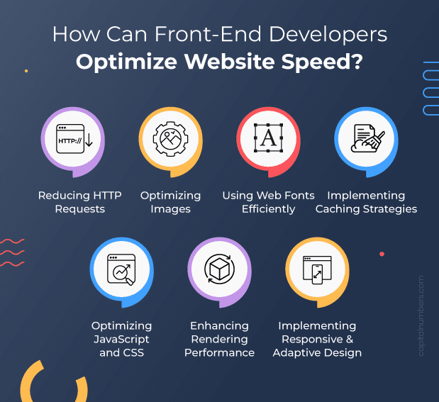
How Can Front-End Developers Optimize Website Speed?

The following are various activities we will discuss to enhance and optimize website performance.
- Reducing HTTP Requests
- By combining multiple CSS and JavaScript files into one, you reduce the number of HTTP requests a browser makes to load a webpage. This speeds up the loading process. Tools like Webpack or Gulp can help automate this bundling process.
- Optimizing Images
- Compression Techniques: Compressing images reduces their file size without significantly affecting their quality. Tools like ImageOptim and TinyPNG can help compress images, making them load faster.
- Responsive Images and Picture Element: Use responsive images to load the appropriate image size for different devices. The <picture> element allows you to define multiple sources for an image, ensuring that smaller devices load smaller images, saving bandwidth and improving load times.
- Lazy Loading Images: Lazy loading means images are only loaded when they are about to enter the viewport. This reduces the initial load time as fewer images are loaded upfront. You can implement lazy loading using the loading=”lazy” attribute in your image tags.
- Using Web Fonts Efficiently
- Choosing Optimized Font Formats: Use modern font formats like WOFF2, which are compressed and optimized for the web, reducing file sizes and loading times.
- Loading Fonts Asynchronously: Load web fonts asynchronously to prevent them from blocking the rendering of your webpage. This can be done by adding the rel=”preload” attribute to your <link> tags or using JavaScript to load fonts after the main content has loaded.
- Implementing Caching Strategies
- Client-Side Caching
- Service Workers for Offline Caching: Service workers are scripts that run in the background of a web page, allowing you to cache resources and provide offline access. They intercept network requests and serve cached responses, reducing the need to fetch resources from the server. This makes your website load faster, even when the user is offline or has a poor network connection.
- Browser Caching with Cache-Control Headers: Browser caching stores resources like images, CSS, and JavaScript files locally on a user’s device. By setting Cache-Control headers, you can specify how long these resources should be cached. For example, Cache-Control: max-age=31536000 tells the browser to cache the resource for one year. This reduces the need for repeated server requests, speeding up subsequent page loads.
- Server-Side Caching
- Content Delivery Networks (CDNs): CDNs are networks of servers distributed globally that store copies of your website’s static content, such as images, CSS, and JavaScript. When a user requests a resource, it is served from the nearest CDN server, reducing latency and load times. Popular CDNs include Cloudflare, Akamai, and Amazon CloudFront.
- Client-Side Caching
- Optimizing JavaScript and CSS
- JavaScript Optimization
- Minification and Obfuscation: Minification removes unnecessary characters like whitespace and comments from your JavaScript code, making it smaller and faster to load. Tools like UglifyJS can help with this. Obfuscation further scrambles the code to make it harder to read, adding a layer of security.
- Tree Shaking to Remove Unused Code: Tree shaking is a technique that eliminates unused code from your JavaScript files. This reduces the overall file size, improving load times. Tools like Webpack use tree shaking to optimize your code during the build process.
- Code Splitting for Loading Only Necessary Code: Code splitting breaks your JavaScript into smaller chunks that are loaded on demand. This means only the code needed for the current page or feature is loaded, reducing initial load times. Webpack and other module bundlers can help implement code splitting.
- Using Asynchronous and Deferred Loading: By adding the async or defer attributes to your script tags, you can load JavaScript files asynchronously. This prevents them from blocking the rendering of your page, allowing the rest of the content to load faster.
- CSS Optimization
- Minifying and Compressing CSS Files: Similar to JavaScript, CSS files can be minified to remove unnecessary characters, reducing their size and improving load times. Tools like CSSNano can be used for this purpose.
- Implementing Critical CSS for Above-the-Fold Content: Critical CSS involves extracting and inlining the CSS needed to render above-the-fold content (the part of the page visible without scrolling). This allows the content to be displayed faster, improving the perceived load time. Tools like Critical can automate this process.
- Using Modern Layout Techniques like CSS Grid and Flexbox: Modern CSS layout techniques like Grid and Flexbox offer more efficient and flexible ways to create complex layouts with less code. This can lead to cleaner and more maintainable stylesheets, as well as improved performance.
- JavaScript Optimization
- Enhancing Rendering Performance
- Minimize Main-Thread Work: The main thread is responsible for rendering the web page. Keeping it free from heavy tasks ensures smooth and fast rendering. Avoid long-running JavaScript functions and reduce the complexity of your stylesheets to keep the main thread responsive.
- Defer Non-Critical JavaScript and CSS: Use the async or defer attributes for non-essential scripts to prevent them from blocking the initial rendering of the page. For CSS, consider loading non-critical stylesheets asynchronously or using media queries to load them only when needed.
- Virtual DOM Management: Both React and Vue use a Virtual DOM to efficiently update the user interface. By comparing changes to a virtual representation of the DOM, they minimize the number of direct manipulations to the real DOM, improving performance. Optimize this by minimizing re-renders and using shouldComponentUpdate in React or watch properties in Vue.
- Leveraging Efficient State Management Libraries (Redux, Vuex): State management libraries like Redux for React and Vuex for Vue help manage application state efficiently. They provide a central store for all application state, reducing the need for complex state handling across components. This leads to fewer re-renders and more predictable performance.
- Implementing Responsive and Adaptive Design Techniques
-
- Mobile-First Design: Mobile-first design means starting the design process with mobile devices in mind and then scaling up for larger screens. This approach ensures that the website is optimized for smaller screens and slower networks first, providing a better user experience for the majority of users who access websites from their mobile devices. Techniques include simplifying layouts, using larger touch targets, and optimizing images and other assets for faster load times on mobile.
- Responsive Images: Responsive images adapt to different screen sizes and resolutions, improving performance and user experience. The srcset attribute allows you to specify multiple image sources for different screen sizes, while the sizes attribute defines the layout space for the image at various viewport widths. This way, the browser can choose the most appropriate image to load, reducing unnecessary data usage and improving load times.Example: <img src=”small.jpg” srcset=”medium.jpg 600w, large.jpg 1200w” sizes=”(max-width: 600px) 100vw, 50vw” alt=”Responsive Image”>
-
- Media Queries and Viewport-Based Resource Loading: Media queries are used to apply different styles based on the device’s characteristics, such as screen size, resolution, and orientation. This allows you to create flexible layouts that adapt to various devices.
- Viewport-Based Resource Loading: Load resources based on the viewport size to improve performance. For example, load high-resolution images only on large screens and low-resolution images on small screens. This technique ensures that users only download the necessary resources, reducing load times and saving bandwidth. Example:
        @media (max-width: 600px) {
            .container {
                flex-direction: column;
            }
        }

        @media (min-width: 601px) {
            .container {
                flex-direction: row;
            }
        }
You May Also Read: Angular vs. React vs Vue.js: Which is the Best Front-End Framework for Your Web App?
Conclusion
We covered key techniques for optimizing web performance, including minimizing HTTP requests, implementing effective caching strategies, optimizing JavaScript and CSS, enhancing rendering performance, and using responsive design and adaptive techniques.
Looking ahead, new technologies like HTTP/3, WebAssembly, and advanced JavaScript frameworks will continue to improve performance. Progressive Web Apps (PWAs) and machine learning for predictive loading are also emerging practices to watch.
Hiring skilled front-end developers is crucial for maintaining and enhancing web performance. They bring technical expertise and can implement the best practices discussed, ensuring your website runs efficiently. Expert developers help drive continuous performance improvements, leading to a better user experience and higher business success.


 Web Development
 Cloud Engineering
 Mobile App Development
 AI/ML/GenAI
 E-commerce
 Software Development
 UI/UX
UI/UX QA
QA Dedicated Teams


