10 Elements for a Landing Page That Converts
Table of Contents
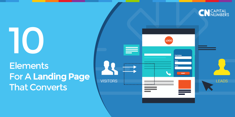
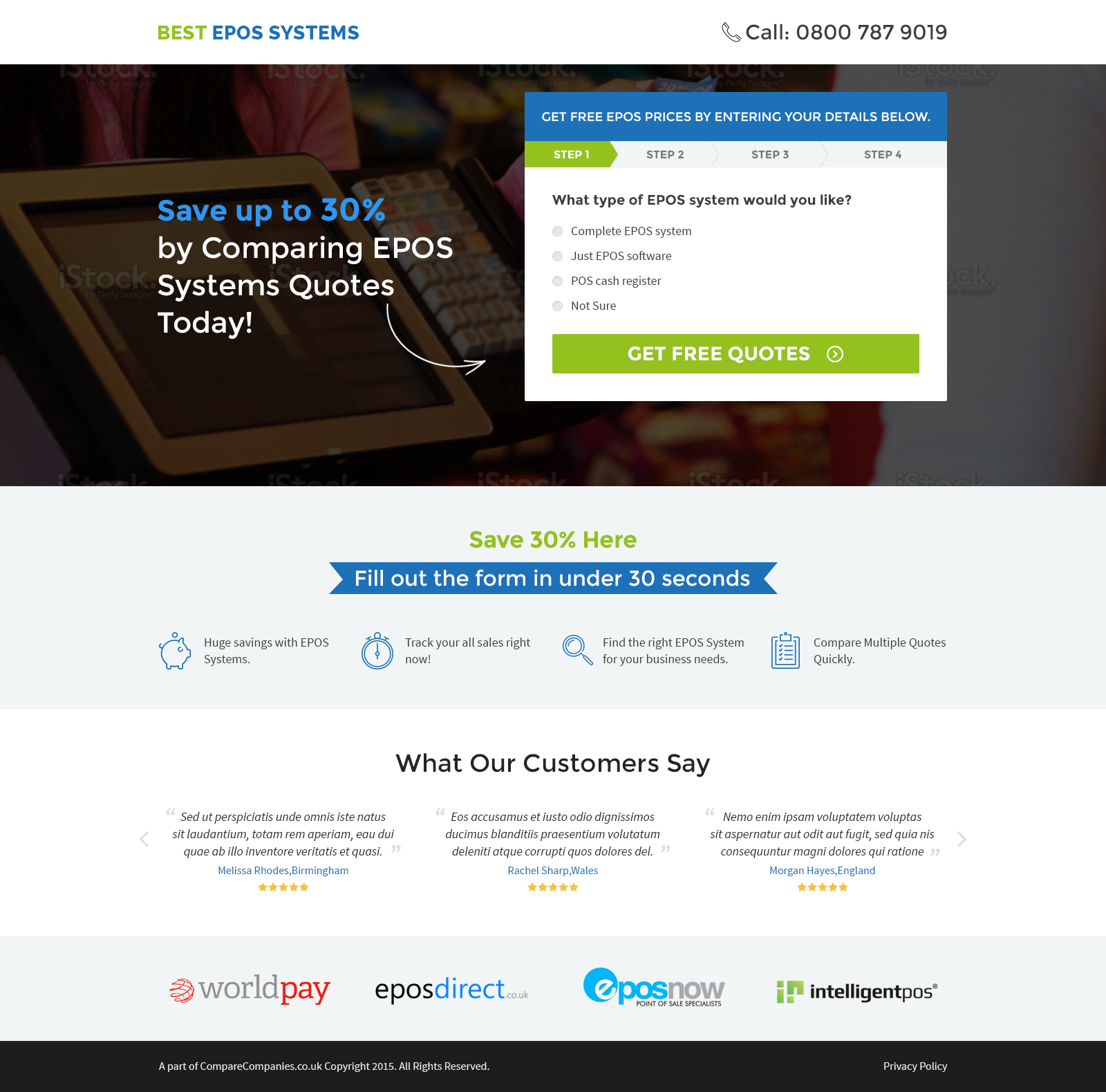
A landing page is the first digital experience that a user has with the brand. And considering the two types of landing pages – Click-Through Landing Page & Lead-Gen Landing Page – it is of paramount importance that there is a definitive closure to a user journey on the page. And how does one define the closure of a user journey? Simple; by just measuring the conversion!
Here is a list of 10 elements that are essential to a landing page if conversion is the key objective.
#1 – Buyer Persona – 2 words you should hold very close to your heart!
Create the page keeping the Buyer Persona in mind – now wait, what is Buyer Persona you ask? They are the group you would like to reach through your marketing activities.
As per the Buyer Persona Manifesto, a brand should know whom they are talking (not selling) to. With Buyer Persona in mind, you would be knowing who you are selling to, their micro-moments, their perception barriers and their problems. And once you know the problem(s), it is easy to convert the audience by offering apt solution(s).
#2 – Above the Fold
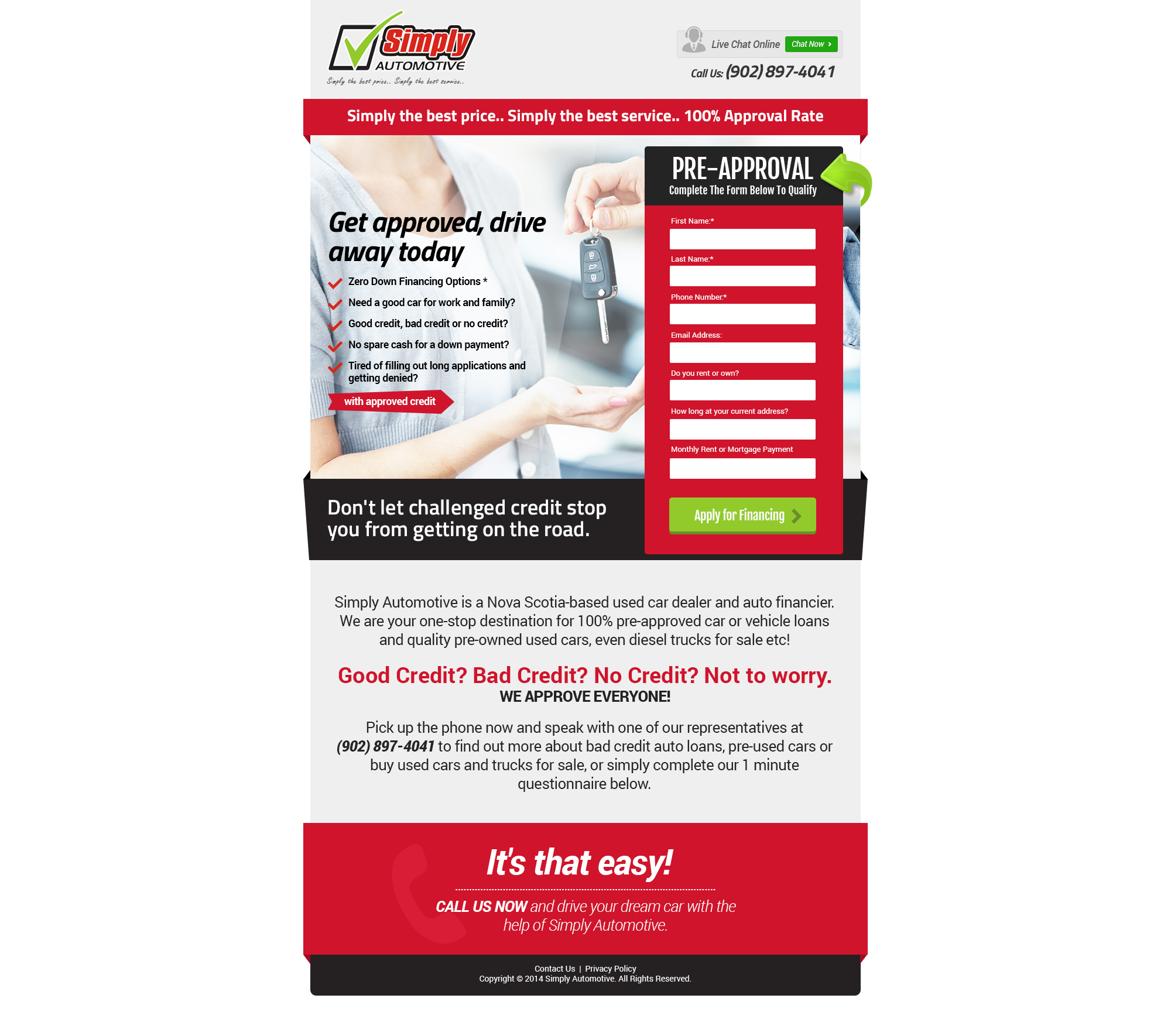
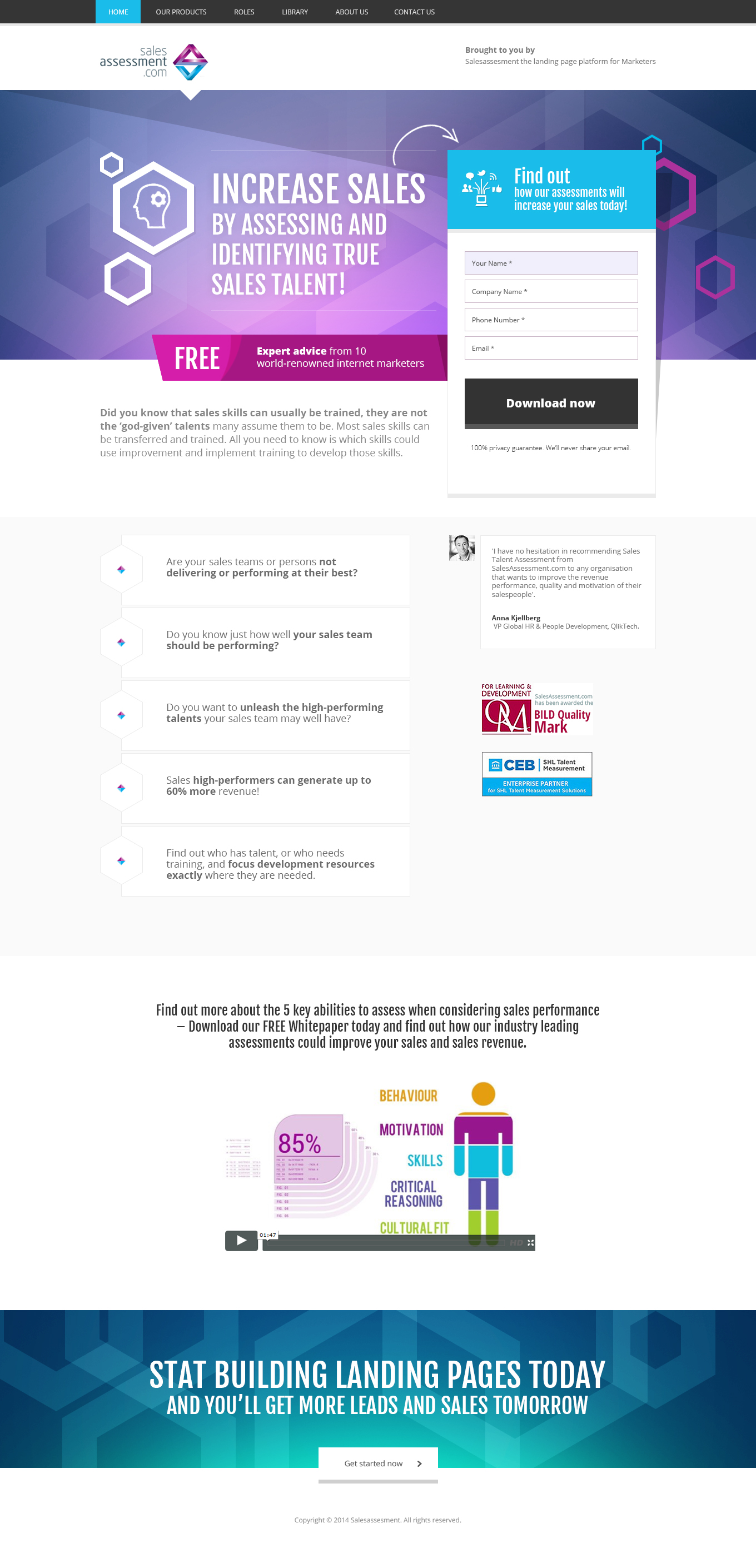
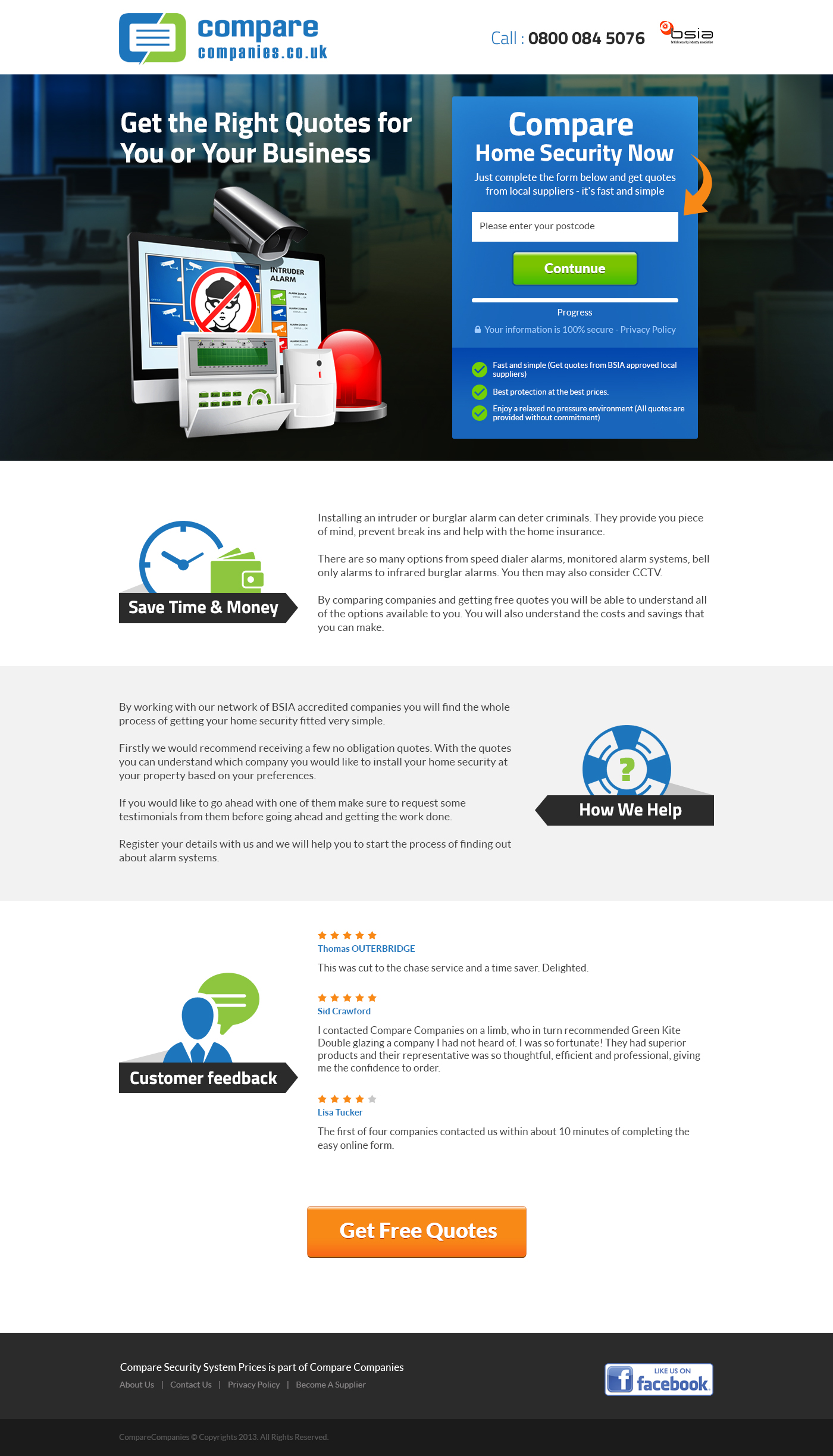
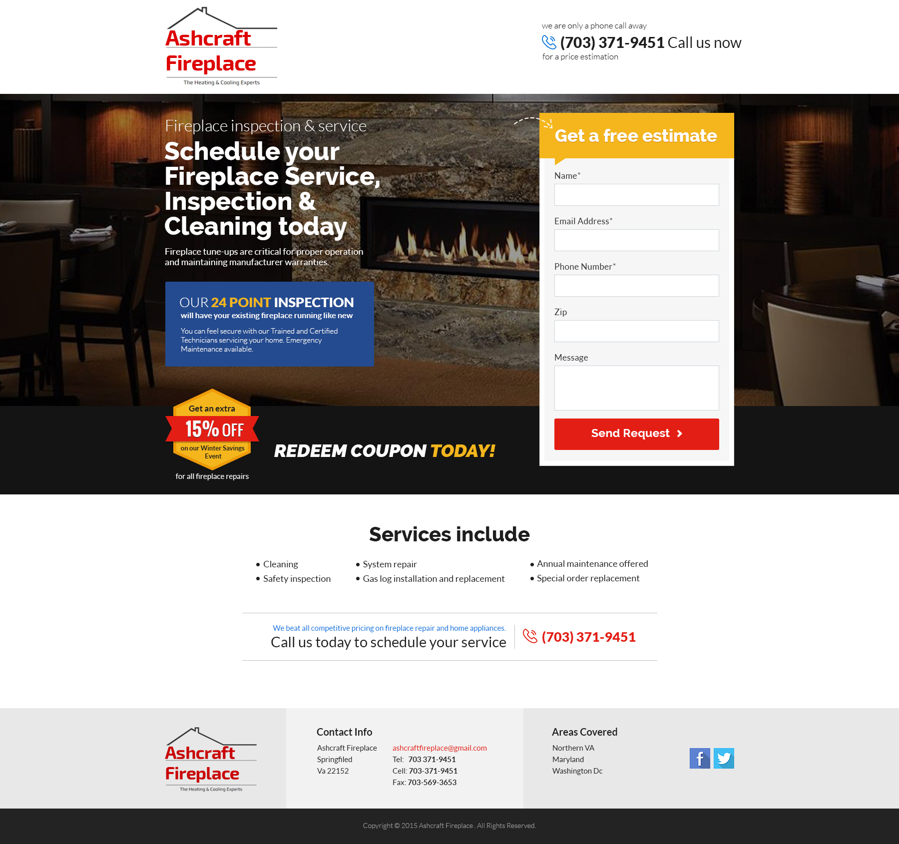
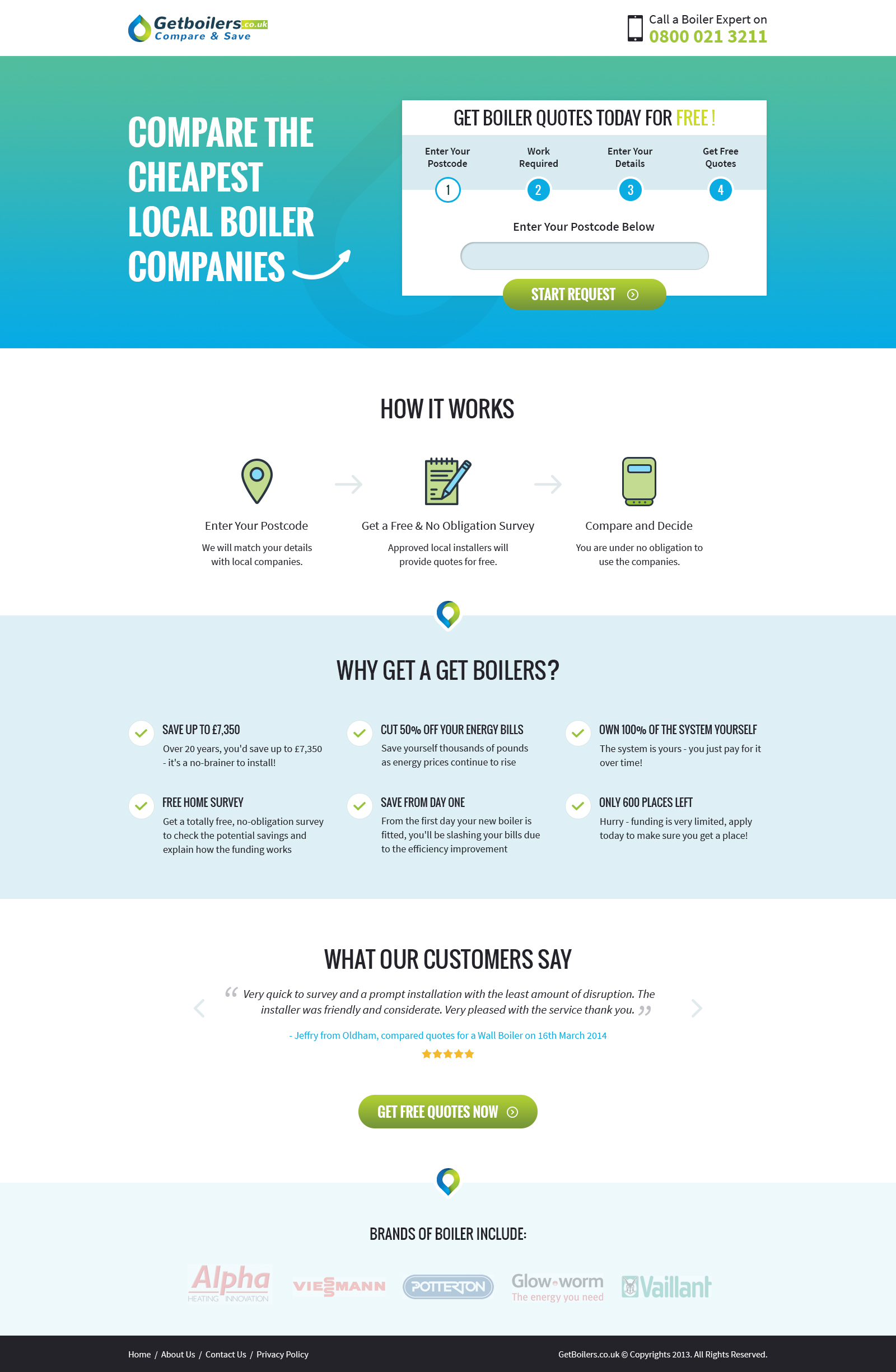
A cue from the traditional newspapers, it is equally important thus to have a super/b above-the-fold content when it comes to landing pages. The important elements have to be present in the most visible format so that the user will read it definitely before scrolling her / his way down.
What should ideally be a part of the ATF content?
- Value proposition – how this site will benefit the reader
- Visuals – to support the value proposition claim(s)
- CTA – what is the intended closure that the site expects from the user?
However, do not ignore the page load speed.
#3 – Testimonials
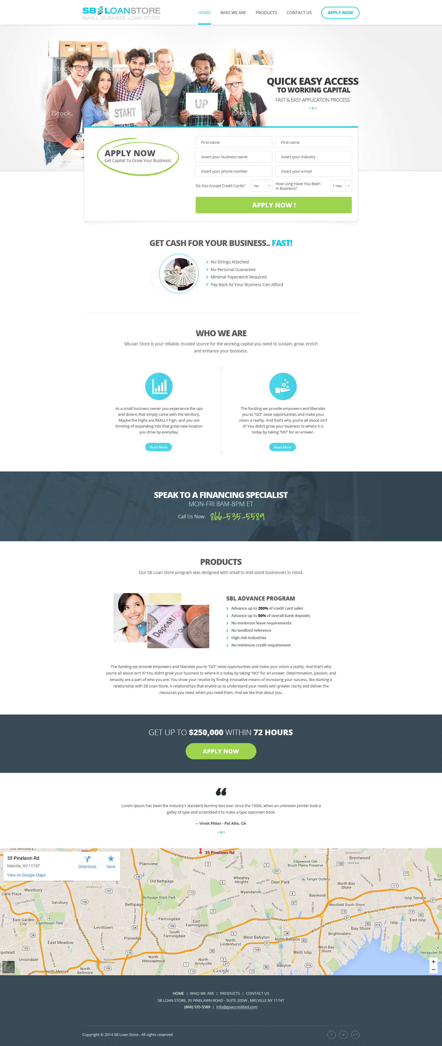
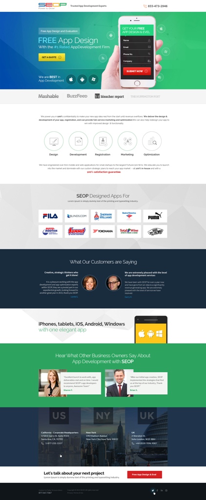
Credibility is a must these days, when one is about to explore the domains of a digital journey. And what best than having a few strong testimonials right at the start? A user should be assured right at the beginning on her / his probable association with the brand – and only an existing / past satisfied user can bring that in, in the form of a testimonial.
#4 – Social proof
Taking cue from the above point, social proofs are a great way to convert a random visitor to a brand-loyal. Here’s how (apart from the testimonial trick) –
- Case studies are a must. Nothing works like success stories do.
- Social share buttons embedded at some area of the landing page.
- Share the positive enthusiasm that the users have around the brand, on social media. Monitor the social media accounts, look out for appreciations and share them for the world to see.
- Trust seals are a great way a user can be assured.
- Last, linking the privacy policy somewhere will definitely assure the user that the data collected will not be used for commercial purposes by the organization.
#5 – Navigation
Directional cues, arrows, pointers, anything that assists the user helps her / him go all the way
A picture speaks a thousand words. Period! Good images will always rule the landing page, any day. Invest in good photographer(s), allocate a specific budget for shoots, and see how conversion grows.
#7 – Copy
And this is another sure-fire way to grab the attention of the user, backed by captivating visuals. Killer headlines will definitely work – also, since the page will be aligned to specific Brand Persona, it is always advisable to have copy / content that is in sync with the Brand Persona.
#8 – Shorter landing pages
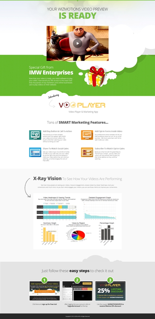
We all try and achieve this; most of us fail. However, it is always a goal to have a landing page where there is no below-the-fold content. Results show that shorter landing pages perform better compared to the longer versions.
#9 – Fitt’s Law and the CTA button
Before you freak out, Fitt’s Law is where the visual hierarchy of the landing page becomes very important. As per this law, related items should be placed together in a clutter format within the page. The more scattered related items, the more time and effort the user will have to take to find and interact with these items.
Thus, as a corollary to this law, a CTA button will have to be provided with the most important position in the visual hierarchy; else the conversion will take a considerable hit.
#10 – Utilize the whitespace
Last, it is a common thought that too much space is being wasted if there is a visible whitespace on screen. Please note, whitespace is the fundamental building block of good design. Here’s why:
- Whitespace increases content readability and legibility from a user’s POV.
- With increased content visibility, user has more interaction with the site / page / content.
- CTAs can be better highlighted with a strong whitespace in action.
- Whitespaces act as separators. After all, to us what is a fold may not stand true for a user.
At Capital Numbers, we are always conversion-focussed. These references have been taken right from our daily experiences. Hope you have enjoyed them.
Do you have anything more to add to this list? Do let us know by commenting below.

