Decoding the Magic: A Deep Dive into the Browser Rendering Cycle
Table of Contents
Have you ever wondered how the websites you visit come to life on your screen? Behind the scenes, web browsers perform a complex symphony of tasks to fetch, interpret, and display web content seamlessly. But how do they work to ensure a seamless rendering cycle? Well, explaining it in one sentence is difficult. Let’s explore it in detail.
Understanding the rendering process:
The rendering process in web browsers is responsible for interpreting and displaying web content, including HTML, CSS, and JavaScript, to users. This process consists of several steps and components, including:
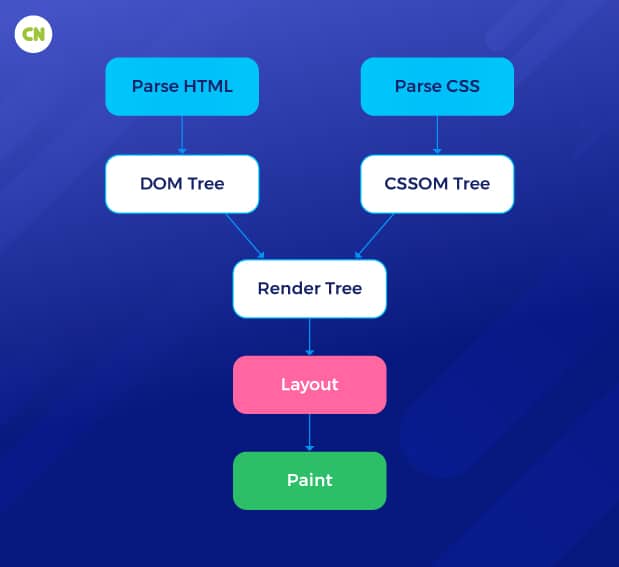
- HTML parsing: The Document Object Model (DOM) tree that describes the web page’s structure is created by the browser’s parser after it has read and interpreted the HTML code.
- CSS parsing and styling: A CSS Object Model (CSSOM) is produced by the browser’s parser after reading and interpreting CSS files. A render tree is produced by combining the DOM and CSSOM and contains all elements and their calculated styles.
- Layout: The position and size of each element in the render tree are determined by the browser during layout, taking into account the viewport dimensions, element placement, and CSS layout variables. A series of boxes illustrating the visual portrayal of each element are created as a result of this approach.
- Painting: Text, photos, backgrounds, borders, and other visual elements are rendered in each box on the screen by the browser. The unified visual representation of the web page is made up of several painted components.
- Compositing: To composite and show the web page, contemporary browsers frequently take advantage of hardware acceleration. Elements with opacity, transformations, or visual effects may be composited into layers to enable smoother animations and interactions.
- Display: The user’s screen shows the composed and painted material. Whenever it is necessary, especially during animations or user interactions, the browser automatically changes the display.
- JavaScript execution: JavaScript has the potential to influence rendering. The browser may delay rendering when it comes across JavaScript code to run the script. JavaScript can alter the DOM and CSSOM as well as start animations or dynamic content loading throughout the rendering process.
Modern browsers prioritize rendering performance to provide a seamless and responsive user experience. They use methods like lazy loading, preloading, and caching to speed up the procedure and reduce the amount of time needed to render a web page. Web developers can also increase rendering performance and user experience by optimizing their code and assets during web application development.
There are many intricate components and stages involved in web browser rendering. Modern browsers use several methods to enhance rendering efficiency and guarantee a quick and responsive user experience.
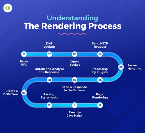
A step-by-step procedure may also be used to describe how web browsers retrieve and display online pages:

- Enter URL: The user enters a URL into the address bar of the browser.
- Parse URL: To determine the protocol, host, port, and path, the browser parses the URL. Following that, it generates an HTTP request using the chosen protocol.
- DNS lookup: The browser uses a DNS lookup to convert the host’s human-readable name into an IP address to connect to it.
- Open socket: The browser establishes a connection between the user’s machine and the host’s IP address, ordinarily on port 80 (HTTP) or the designated port.
- Send HTTP request: After establishing a socket connection, the browser sends the host an HTTP request.
- Server handling: The server software receives the request from the host and evaluates it to decide which server plugin (such as PHP, Java,.NET, or Python) should handle it.
- Processing by plugins: A database or other resources may be accessed as part of the HTTP response generated by the chosen server plugin.
- Send a response to the browser: Sending the HTTP response back to the browser via the established connection is done by the server plugin.
- Obtain and analyze the response: When the answer is received, the browser analyzes the HTML data.
- Create a DOM tree: From the parsed HTML, the browser creates a Document Object Model (DOM) tree.
- Parsing stylesheets: The browser parses stylesheets and links rendering data to the appropriate DOM nodes.
- Execute JavaScript: JavaScript code is interpreted and executed by the browser. Nodes in the DOM can change, and the style data updates correspondingly.
- Page rendering: Using the DOM tree and the associated style data for each node, the browser displays the web page on the screen.
Numerous network queries, parsing, rendering, and scripting actions are used in this procedure. Understanding how web browsers operate is crucial for optimizing websites and enhancing user experience.
Understanding of HTML parsing
Web browsers read and interpret HTML code to produce a Document Object Model (DOM) tree through a process known as HTML parsing. Each node in the DOM tree represents an element in the HTML code and represents a web page’s structure.
The initial stage of browser rendering is HTML parsing. The browser uses the DOM tree to compute the layout of the web page and render it on the screen after the HTML code has been parsed.
Although HTML parsing is a challenging procedure, it is necessary for the browser to display online pages correctly. The browser must be able to parse various HTML code, including well-formed, improperly-formed, and CSS and JavaScript-containing code.
Here is a simplified overview of the HTML parsing process:
- The HTML code is read by the browser character by character.
- Tokens in the HTML code are identified by the browser. Elements, attributes, and text are examples of tokens, which are the fundamental components of HTML.
- The tokens are used by the browser to build a DOM tree. Each node in the DOM tree represents an element in the HTML code, defining the structure of the web page.
- The browser determines the web page’s layout, which then renders it on the screen using the DOM tree. The DOM tree is used by the browser to run JavaScript code and react to user input.
Here are some important things to keep in mind about HTML parsing:
- To prevent parsing mistakes, it’s crucial to write well-formed HTML code because HTML parsing is a complicated operation.
- It’s crucial to test your website with several browsers to ensure it displays properly because the browser may incorrectly handle HTML code.
- Understanding how JavaScript may impact how your web page renders is critical because it can be used to modify the DOM tree at runtime.
You can develop better HTML code and make websites more browser-compatible by becoming familiar with the fundamentals of HTML parsing.
Understanding of CSS Object Model –
The styles applied to HTML elements on a web page are represented by the CSS Object Model (CSSOM). It outlines how web browsers can access, change, and arrange CSS styles. The Document Object Model (DOM) and CSSOM work together to provide the final visual display of a web page.
The CSS Object Model should be understood in the following ways:
Structure: Similar to the DOM, the CSSOM arranges CSS styles into a hierarchical structure. Each CSS rule is represented by an object with properties and values that provide the style declarations.
Specificity and Cascading: The CSSOM considers the cascading aspect of CSS, where styles from several sources, such as external stylesheets, inline styles, or browser defaults, are merged to produce the final styles applied to an element. To resolve conflicts between styles, specificity rules are often used.
Accessing Styles: The CSSOM offers ways to access and get computed styles for particular items. As a result, information about the applied styles to an element, such as color, font size, or placement, can be retrieved programmatically.
Manipulating Styles: Modifying or manipulating styles on the page dynamically is also possible for the CSSOM. Developers can implement animations, build interactive experiences, and respond to user interactions by gaining access to and changing CSS attributes and values via the CSSOM.
Style Computation: The CSSOM performs style computation, which involves figuring out the final styles applied to each element in accordance with the specificity of the CSS rules. This procedure establishes how styles interact and cascade.
Performance Considerations: Changing the CSSOM may impact performance because doing so may require recalculating the layout and rendering. To reduce the performance overhead, it is typically advised to batch style adjustments together wherever possible.
The CSS Object Model, in general, offers a systematic representation of CSS styles applied to HTML elements. It enables developers to dynamically access, retrieve, and edit styles and build engaging and visually appealing web experiences.
Here are some additional information about CSSOM:
Relationship with the Document Object Model (DOM): The DOM and CSSOM collaborate to determine how a web page will ultimately be shown. The CSSOM represents the styles applied to the elements in the DOM, whereas the DOM defines the structure and content of the web page. They combine to create the Render Tree, which the browser uses to create the visual representation.

Accessing CSSOM Properties: To access and modify CSS styles, the CSSOM offers several properties and methods. For instance, you can use JavaScript to acquire or alter an element’s inline styles by accessing the element’s style attribute. To acquire the final styles applied to an element after considering all CSS rules, you can also access computed styles by utilizing methods like get Computed Style.
Modifying CSSOM: To change the styles applied to elements, developers can adjust the CSSOM dynamically. This can be accomplished by programmatically adding, changing, or removing CSS rules from stylesheets or directly editing the CSS properties of an element’s style object.
CSSOM View Module: The CSSOM View module is a particular section of the CSSOM specification offering extra viewport and layout control features. It has methods and properties for interacting with the browser’s viewport, dealing with scrolling issues, and managing element positioning and layout.
Browser Support: The CSSOM may be implemented differently by different browsers. While most contemporary browsers offer full CSSOM support, certain older browsers might only provide partial support or lack specific capabilities. When using the CSSOM, it’s crucial to consider browser compatibility.
Performance Optimization: When making frequent updates or using complicated styles, manipulating the CSSOM can impact performance. Performance can be improved by limiting needless style changes and substituting CSS transitions or animations for direct style changes.
CSSOM vs. Stylesheets: Unlike stylesheets, the CSSOM represents the styles applied to elements in a more structured and programmable manner. The CSSOM enables developers to dynamically access, alter, and compute the final styles applied to components while stylesheets specify the guidelines and declarations.
For web developers who wish to create dynamic and interactive web pages, understanding the CSSOM is crucial. To create aesthetically beautiful and responsive user experiences, developers can access, edit, and calculate CSS styles using the CSSOM.
Understanding of Layout Creation –

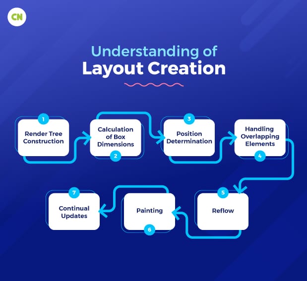
Layout creation is a crucial stage in the rendering process of a web browser that determines the size and position of each element on a web page. It directly affects how the web content appears to users. Here’s a restatement of the process:
- Render tree construction: The browser combines the DOM tree and CSSOM to create a render tree, which includes only the visual elements that will be displayed.
- Calculation of box dimensions: The browser determines the width and height of each box in the render tree, considering factors like content size, padding, border, margin, and box size.
- Position determination: The browser establishes the position of each box relative to the viewport, using various positioning methods such as normal flow, floats, absolute positioning, fixed positioning, Flexbox, or Grid layout.
- Handling overlapping elements: To handle elements that overlap, the browser employs the stacking context and the Z-index property to determine the stacking order. Elements with higher Z-index values are positioned before those with lower values.
- Reflow: When changes occur that affect the layout, such as resizing the browser window or modifying element dimensions, the browser triggers a reflow. This process recalculates the layout for the affected elements. To optimize performance, browsers use techniques like batching changes and deferred layout calculations to minimize reflows.
- Painting: Once the layout is determined, the browser paints the elements on the screen according to their dimensions and positions. This involves rendering text, images, backgrounds, borders, and other visual properties.
- Continual updates: Modern browsers continuously update the display, particularly during animations or user interactions. This may necessitate additional layout calculations and painting.
Efficiency in layout algorithms and optimization techniques is crucial for maintaining good rendering performance.
Key takeaways:
- Layout creation is a critical stage in browser rendering that affects the visual presentation of web content.
- The process involves constructing the render tree, calculating box dimensions, determining element positions, handling overlapping elements, triggering reflows, painting, and continual updates.
- Efficient layout algorithms and optimization techniques are vital for optimal rendering performance.
Understanding of Printing, composition, and display :
Printing, composition, and display are essential to how web browsers render web pages. Let’s explore each of these concepts:
Printing:
When a user prints a web page, the browser must adapt it to a physical medium, such as paper. This involves several considerations:
Page layout: The browser determines how to divide the content across multiple pages, if necessary. It calculates page breaks to ensure that the content flows logically and doesn’t get cut off.
Margins and scaling: Margins are added to the content to prevent text and images from touching the edges of the paper. The browser may also adjust the scaling of the content to fit the chosen paper size.
Media-specific styles: CSS stylesheets can include rules specifically designed for print media. This allows for different formatting and hiding elements not relevant for print.
User control: Browsers often provide users with options to control the printing process, such as choosing the paper size, orientation (portrait or landscape), and whether to include headers, footers, or background colors and images.
Composition:
Composition involves arranging and layering visual elements on a web page to create a cohesive presentation. This includes:
Layering and stacking: Elements are stacked on top of each other based on their stacking context and Z-index. Elements with higher Z-index values appear in front of those with lower values. This ensures that the elements are visually ordered as intended by the web designer.
Transparency and blending: Modern web design often includes transparent elements, such as overlapping images or semi-transparent backgrounds. Composition handles blending these elements to create the final visual result.
Responsive design: Composition plays a role in responsive web design by adjusting the layout and arrangement of elements based on the screen size and device orientation. This ensures that web content looks good on various devices, from small smartphones to large desktop monitors. It is also helpful for you when you are considering custom UI/UX design.
Performance considerations: Efficient composition is critical for rendering speed. Browsers aim to minimize redundant calculations during composition to provide a smooth user experience.
Display:
The display in a web browser includes the rendering of web pages and the entire browser user interface. This UI contains elements like the address bar, bookmarks, navigation buttons, and toolbars.
The browser continually updates the display in response to user interactions. For example, scrolling causes content to move, clicking on links navigates to new pages, and resizing the browser window adjusts the layout.
The rendering engine is responsible for rendering web pages and ensuring that HTML, CSS, and JavaScript are displayed correctly. It translates code and data into a visual representation on the screen.
Rendering performance is critical for a smooth user experience. Browsers use various techniques to optimize rendering, such as hardware acceleration, lazy loading of images, and caching of resources.
Also read: Top 5 Web Design Trends to Transform Your Website in 2023
Conclusion
In a nutshell, a solid understanding of the browser rendering process is important for web developers who want to create seamless and visually appealing websites. From HTML parsing to CSSOM manipulation and layout creation, each step plays a crucial role in presenting content to users. Understanding the interplay of these elements allows developers to optimize their code for better performance and user experience.
Efficient rendering improves the speed and responsiveness of web pages and contributes to the overall success of a website. By following the best practices and leveraging the capabilities of modern browsers, developers can ensure that their web content shines, providing users with an engaging and enjoyable online experience.
If you are looking for offshore web development services, look no further than Capital Numbers. Equipped with a team of 750+ expert developers, we offer custom solutions at affordable prices. Want to get our services? Book a call today!


